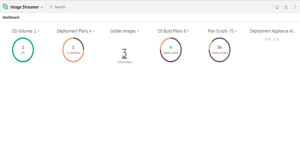
About Dashboard chart colors
The
Dashboard chart colors help you to interpret the reported data.
- Green
-
This color denotes a healthy status.
- Yellow
-
This color denotes that your attention is required for an event that has occurred.
- Red
-
This color denotes that your immediate attention is required for the occurrence of a critical condition.
- Purple
-
This color denotes the number and type of resource instances being shown at the center of the donut.
- Orange
-
This color denotes the number and the remaining type of the resource instances, which can be seen once mouse hover the donut.