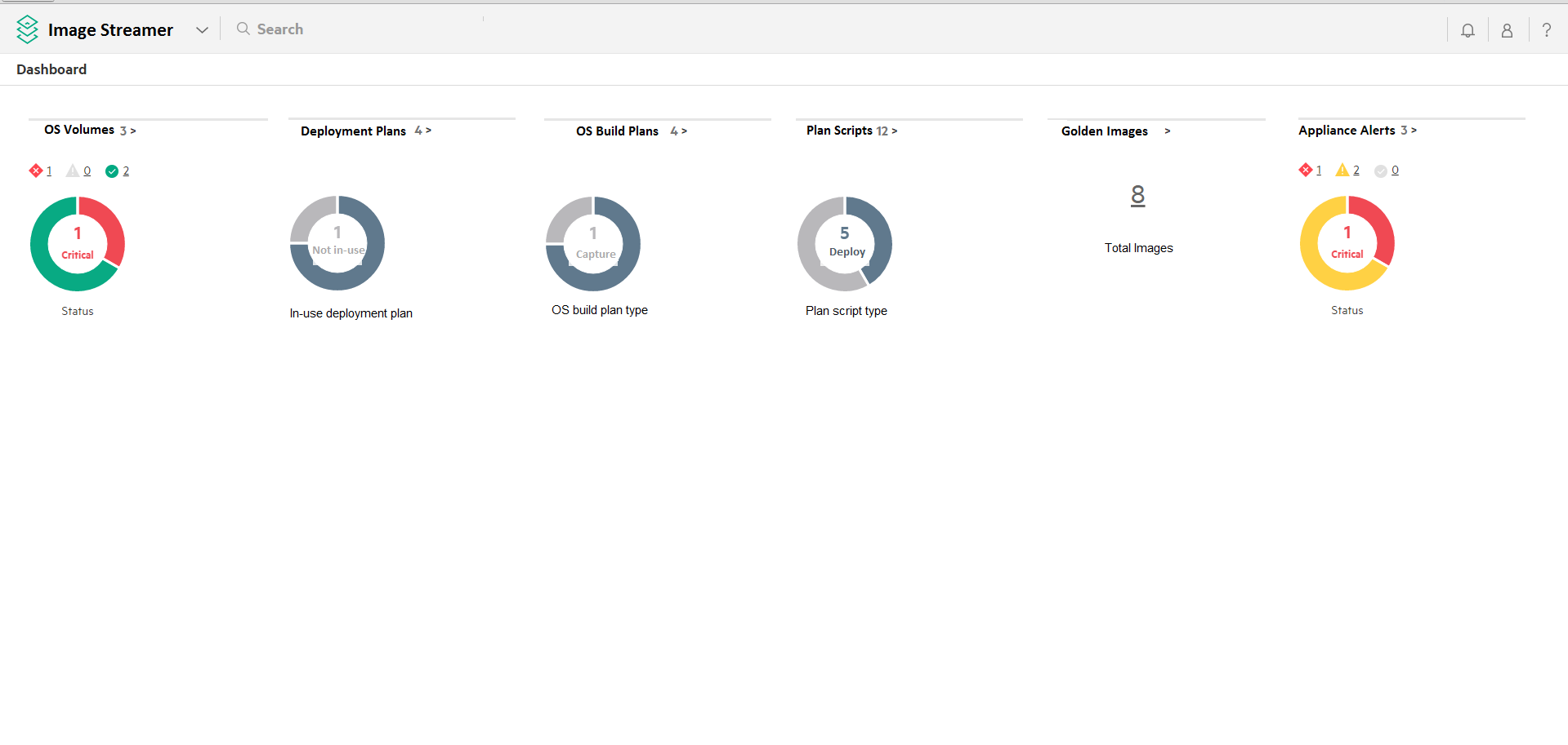
About Dashboard chart colors
The
Dashboard chart colors help you to interpret the reported data.
- Green
-
This color denotes a healthy status.
- Yellow
-
This color denotes that your attention is required for an event that has occurred.
- Red
-
This color denotes that your immediate attention is required for the occurrence of a critical condition.
- Light gray
-
This color denotes that the resource instances do not match the data being measured.
- Dark gray
-
This color denotes the statuses other than
OK,Warning, orCritical. This color denotes the resources that areDisabledorUnknown.