Saturation chart
Analytics view of Systems screen.
The Top systems by saturation panel in the Dashboard for a single system.
Overview View of Systems screen.
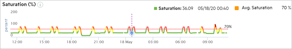
Saturation levels of the storage system during the selected time interval.
Periodicity in the change of saturation levels.
The saturation chart in the Analytics view indicates the saturation levels of the storage system that are measured using data samples from the selected time interval.
The best way to interpret the saturation chart is to look for persistent high values. You can compare the saturation with the RPM gauge in a car. You can cross the red line every once in a while, but you cannot continue to stay beyond the red line for a long time. The saturation value shows that the array is driving close to the theoretical maximum IOPS value that a similar configuration can drive within an acceptable latency. If you continue to stay at a high value for a long time, it can be difficult to add extra workloads to the array in the future.
There is no concern if the array periodically reaches 70% of the theoretical maximum IOPS value and then drops subsequently. However, when there is a perceived high latency on the application side and those periods correlate with the high saturation values, it can be an indication that the high latency is likely due to the saturation levels on the array.
Calculating saturation level
Type of workload that is running on the storage system: The workload running on a storage system depends on the request size and the percentage of read and write throughput that is serviced by the system.
Virtual volume types.
- Configuration and workload parameters of the storage system. The configuration and workload depend on the following:
Product model
Number of nodes
Number of Host ports
Number of chassis
Number of disks count
Host port type
Disk type
Raid level
Port type
Drive type
The relevant metrics are measured at a 5 minute interval and the preferred throughput (number of inputs/outputs per second) is calculated. The throughput the storage system is able to deliver within a reasonable response time is defined as the preferred throughput. The preferred throughput is measured against the actual throughput that is being serviced by the storage system. The preferred throughput varies with the configuration and the type of workload that is running on the storage system. The ratio is represented as percentage in the line chart.
If you have a storage system with lesser than the optimal number of drives, saturation levels can exceed 100%. The preferred throughput is an indicator of the optimal threshold. The storage system is expected to perform appropriately when the saturation is within the optimal threshold. However, the system could still deliver more inputs/outputs per second beyond this level but the latency would be high.